

Good restaurant design must look spectacular while also functioning flawlessly. The right layout, materials and flow have a huge effect on how customers feel, how efficiently staff work, and ultimately how profitable the business becomes. Whether it’s a full-service restaurant or a quick-service restaurant, every decision shapes the experience and the bottom line.

AW Architectural has spent years designing for major high-street brands, and we’ve seen what works and what doesn’t. Here are seven of the most common interior design mistakes restaurants make, and how to avoid them.
Mistake 1: Ignoring Customer Flow And Space Efficiency
A poor restaurant layout plan can ruin even the best concept. When customers and staff constantly cross paths, queues will form and the service will slow down. It creates frustration all around. In a well-designed space, customers move naturally while staff circulate efficiently. Bottlenecks don’t get a chance to form.
That’s why we begin each design by analysing how people move. Entrances, waiting zones, ordering points and seating areas all need to support both the operation and the experience. In quick-service restaurant design, flow is everything. The route from order to pick-up should be effortless, while kitchen access must remain clear.
Poor flow doesn’t only cause congestion, it also costs money. When staff movement is inefficient, due to long routes or constant customer interaction, it directly compromises productivity. Multiply that by hundreds of transactions per day, and the waste becomes obvious. Getting the layout right at the design stage saves far more than it costs.
We also consider accessibility and visibility. Customers should be able to see where to go and what to do next without asking. That means clear sightlines, logical sequencing, and no visual clutter. A good layout quietly guides people through the experience.
Mistake 2: Focusing Only On Aesthetics, Not Operations
Many restaurants fall into the trap of pursuing a striking visual idea without testing its operational viability. A stunning dining room is useless if the back-of-house can’t function smoothly. Kitchen workflow design must come first because it dictates how staff move, how fast food is prepared, and how the service feels to the customer.
In both casual dining and fast food restaurant architecture design, we consider the full operation from prep zones and storage to wash-up and service counters. The aesthetics then wrap around that foundation. Beautiful design should never get in the way of a functioning business.
We often see owners who have strong visual ideas but haven’t thought through service flow. They might place the kitchen too far from the servery, or the drinks station directly in the customer line. These small inefficiencies add up and affect both staff morale and customer satisfaction.
Lighting, acoustics and ventilation all fall under this category, too. A dining space that looks good but feels hot, echoing or dimly lit will fail in practice. The same applies to noise from the kitchen. Operational success and ambience should reinforce one another, not compete.
Mistake 3: Not Designing For The Future
Restaurants evolve. Menus change and technologies improve, not to mention the ever-shifting expectations of customers. Spaces that can’t adapt become outdated fast. Flexibility is key, whether it’s modular furniture, adjustable lighting, or layouts that support takeaway and dine-in simultaneously.
When developing a restaurant architecture design concept, we make sure the infrastructure can handle future needs. That means adequate power and data points for new tech, ceiling grids for lighting updates, and layouts that can be reconfigured without full refits. Smart design today prevents costly redesigns tomorrow.
The shift toward delivery and digital ordering has changed how restaurants use their space. Many older layouts struggle with delivery driver traffic or storage for takeaway packaging. We plan these functions from the start. It’s also worth future-proofing for sustainability, allowing recycling zones, energy-efficient systems and smart controls.
Another consideration is growth. Franchisors expanding into new territories need scalable design standards. That means finishes, signage and furniture that can be replicated cost-effectively while maintaining consistency. We design with rollouts in mind, ensuring the first site becomes a blueprint for success rather than a one-off.
Mistake 4: Overlooking The Target Demographic
Every restaurant serves a defined audience, and ignoring who they are leads to tone-deaf design. A fast-casual outlet aimed at students should feel energetic and affordable, while a fine dining space targeting professionals needs calm and refinement.
Good restaurant interior design tips start with understanding who walks through the door. We build personas, study dwell time, and match materials, seating comfort and acoustics to suit the audience. That alignment between form and function turns casual diners into loyal customers.
We also consider cultural expectations and brand psychology. For example, quick service venues rely on turnover, so seating and lighting are designed to feel dynamic. In contrast, destination restaurants benefit from comfort and a slower pace. Everything from table height to sound absorption plays a role in how long people stay and how much they spend.
Ignoring the demographic often shows up in mismatched décor and spaces that look good on paper but feel wrong to the customer. When the design reflects the people using it, the experience feels natural. When it doesn’t, customers notice instantly.
Mistake 5: Disjointed Brand And Décor Alignment
A mismatch between brand identity and interior design can confuse customers and weaken brand recognition. Every surface, colour and texture should express the company’s values and tone of voice.
For franchises and multi-site operators, maintaining this alignment is especially vital. Consistent architecture design restaurant standards ensure customers know what to expect wherever they go. We create detailed brand design guides to help franchisors maintain control while allowing flexibility for local adaptation.
For example, a family-oriented brand should feel welcoming and warm, while a tech-driven urban brand might use sharper lines and cooler tones. Consistency builds trust. If a customer walks into one location in Leeds and another in Milton Keynes, they should feel they’re in the same brand family. That takes more than signage. It’s in the lighting, the furniture, and even the scent.
It’s also about subtlety. Brand alignment doesn’t mean plastering logos everywhere. It’s about translating values into physical space. A sustainability-focused brand might express itself through reclaimed timber, recycled tiles, or low-energy lighting rather than overt messaging.
Mistake 6: Overcrowding to Maximise Covers
Packing in more seats might seem like a smart way to raise revenue, but it often backfires. Tight spacing increases noise, limits movement, and makes service harder. It also undermines comfort, which shortens dining time and discourages repeat visits.
Our approach to restaurant architecture design respects both spatial efficiency and customer comfort. We calculate seat-to-table ratios, aisle widths, and clearance zones to meet operational goals without sacrificing the experience.
Comfort also drives spending, as diners who feel relaxed are more likely to order dessert. They stay for another drink. They come back. Those who feel cramped leave quickly. A few extra tables can cost more in lost revenue than they generate.
In quick-service restaurant interior design, spacing affects perception as well as comfort. Cramped layouts can make a space look cheap, while balanced proportions feel premium, even on the same budget. Careful design can make a small space appear generous.
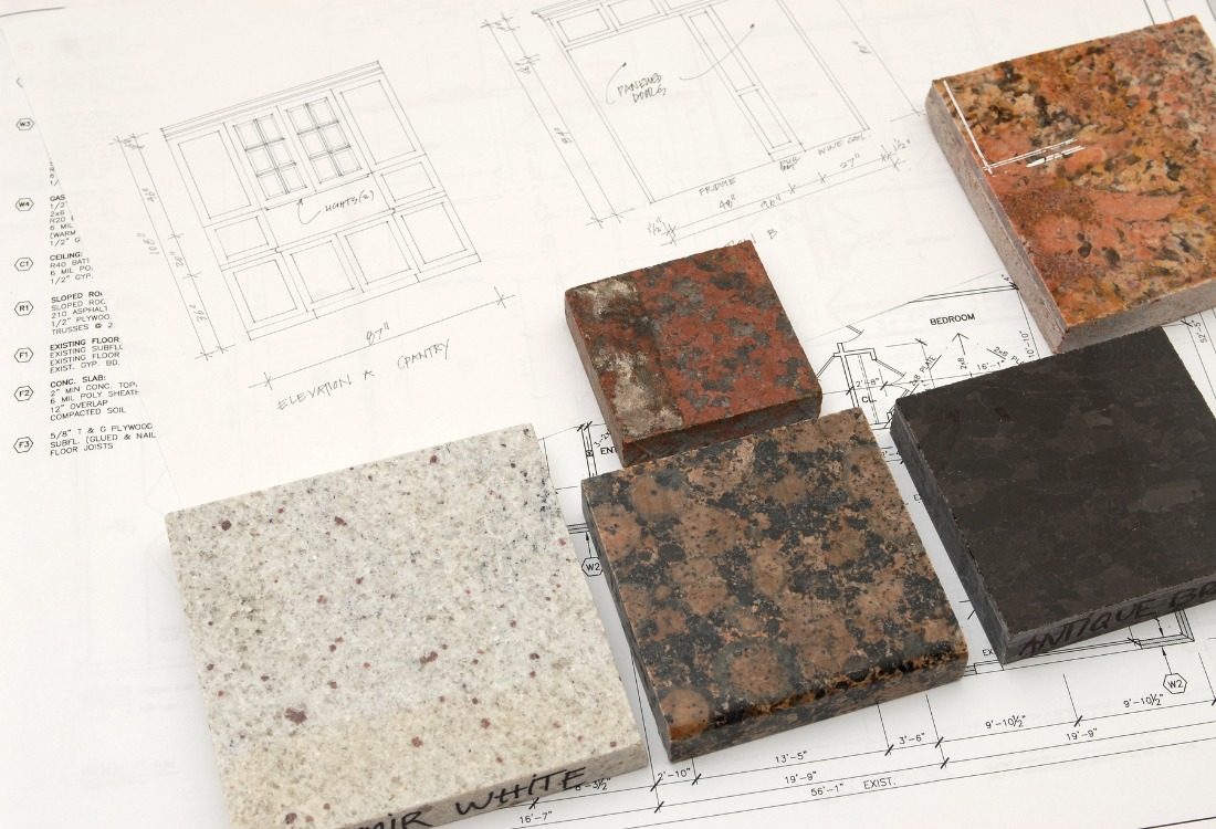
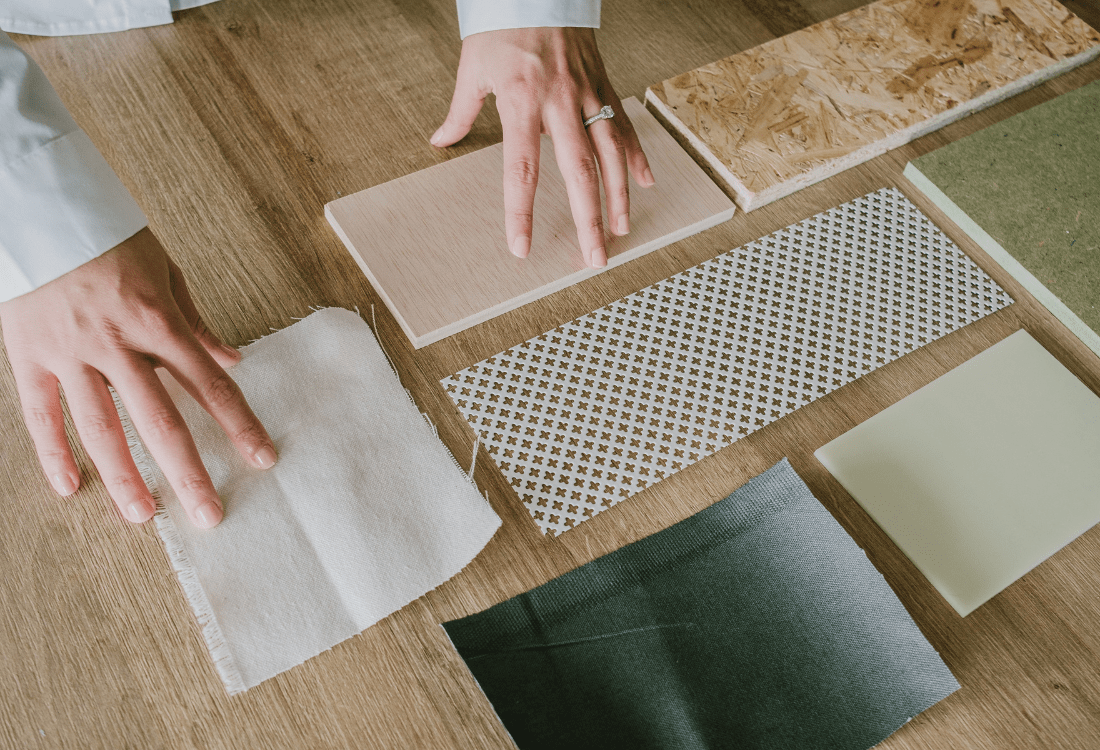
Mistake 7: Choosing Short-Lived Materials
Restaurants endure constant wear from moving furniture to spills and cleaning chemicals, so every surface must withstand heavy use. Choosing trendy finishes or cheap fixtures leads to early deterioration, costly maintenance, and potential safety hazards.
We favour robust, timeless materials. Hard-wearing flooring, heat-resistant surfaces, and durable joinery will keep the space looking fresh for longer. In architecture restaurant design exterior projects, we make sure that materials not only perform but age gracefully, preserving your brand image while reducing waste.
We’ve seen operators drawn to beautiful but impractical materials such as porous stone, softwoods, or finishes that fade under heat. These look good at launch but deteriorate fast. The right materials still look great but require less upkeep.
Material choice also links directly to sustainability. Using recycled or long-life products reduces environmental impact and saves money over the long term. Design should consider lifecycle cost, not just upfront expense.
Designing Restaurants That Last
We like to say that restaurant design is both science and storytelling. It’s about creating spaces that attract, function and endure. Our experience in quick service restaurant design, fast food restaurant architecture design, and large-scale restaurant architecture design projects means we understand the balance between brand vision and operational practicality.
We’ve helped major chains and independents avoid these common interior design mistakes by combining architectural precision with hands-on industry knowledge. Our designs improve flow, efficiency and customer satisfaction without losing the personality that makes each venue distinct.
Designing a restaurant is never just about aesthetics. It’s about building a business that’s profitable, adaptable, and built to last.
If you’re planning a new site or upgrading an existing one, AW Architectural can help you avoid the pitfalls and design a restaurant that performs from day one. Book a consultation or request a free feasibility check today.
What Is Architectural Interior Design?
Why Is Sustainability Important In Interior Design
No Comments Yet
Let us know what you think