

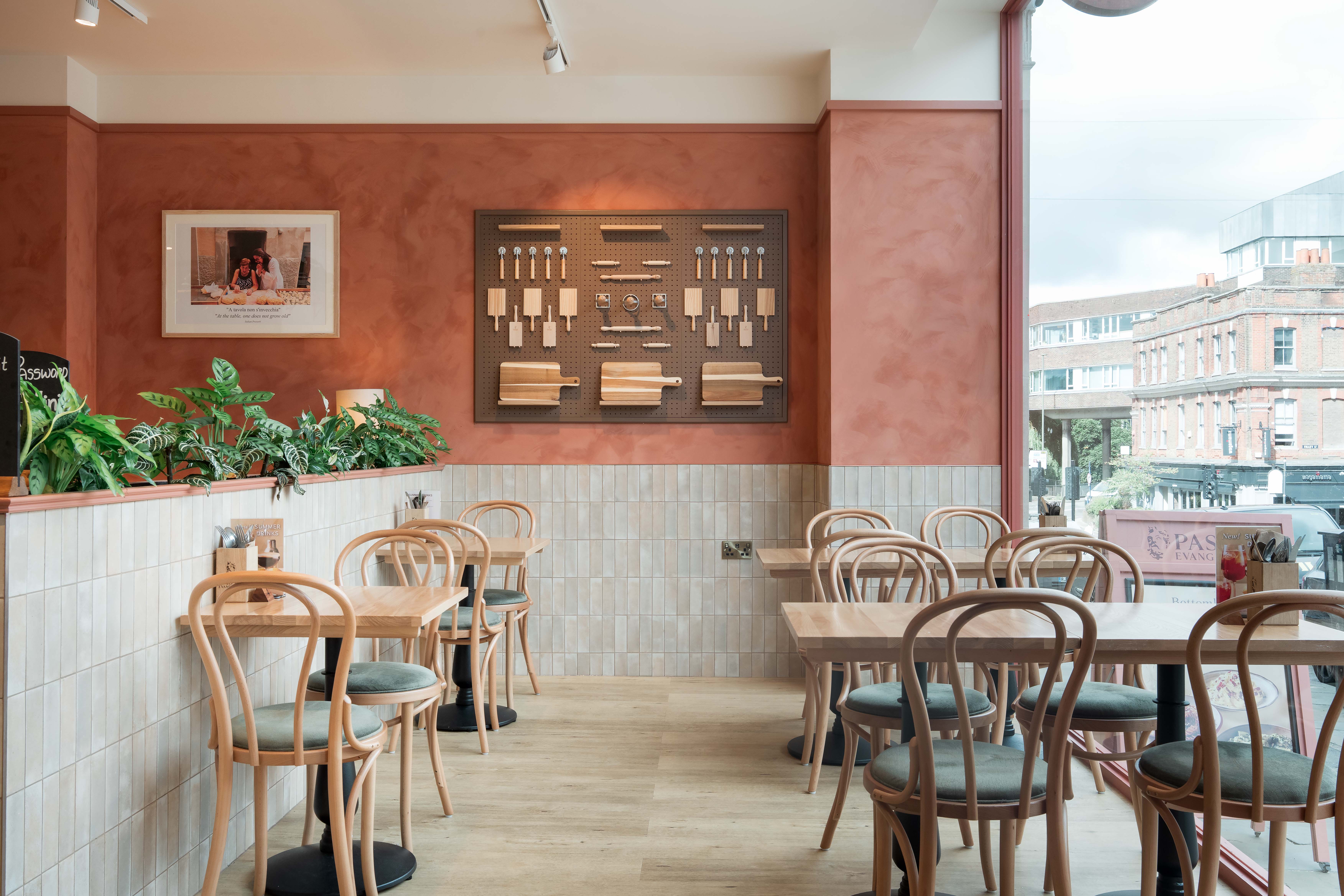
Walk into any restaurant, and before you even look at the menu, the venue’s colour and layout have already influenced your expectations. Restaurant colour design plays a direct role in how a space feels, how busy it appears, and how long people choose to stay. Warm palettes tend to create energy and pace. Cooler tones slow things down and signal comfort.

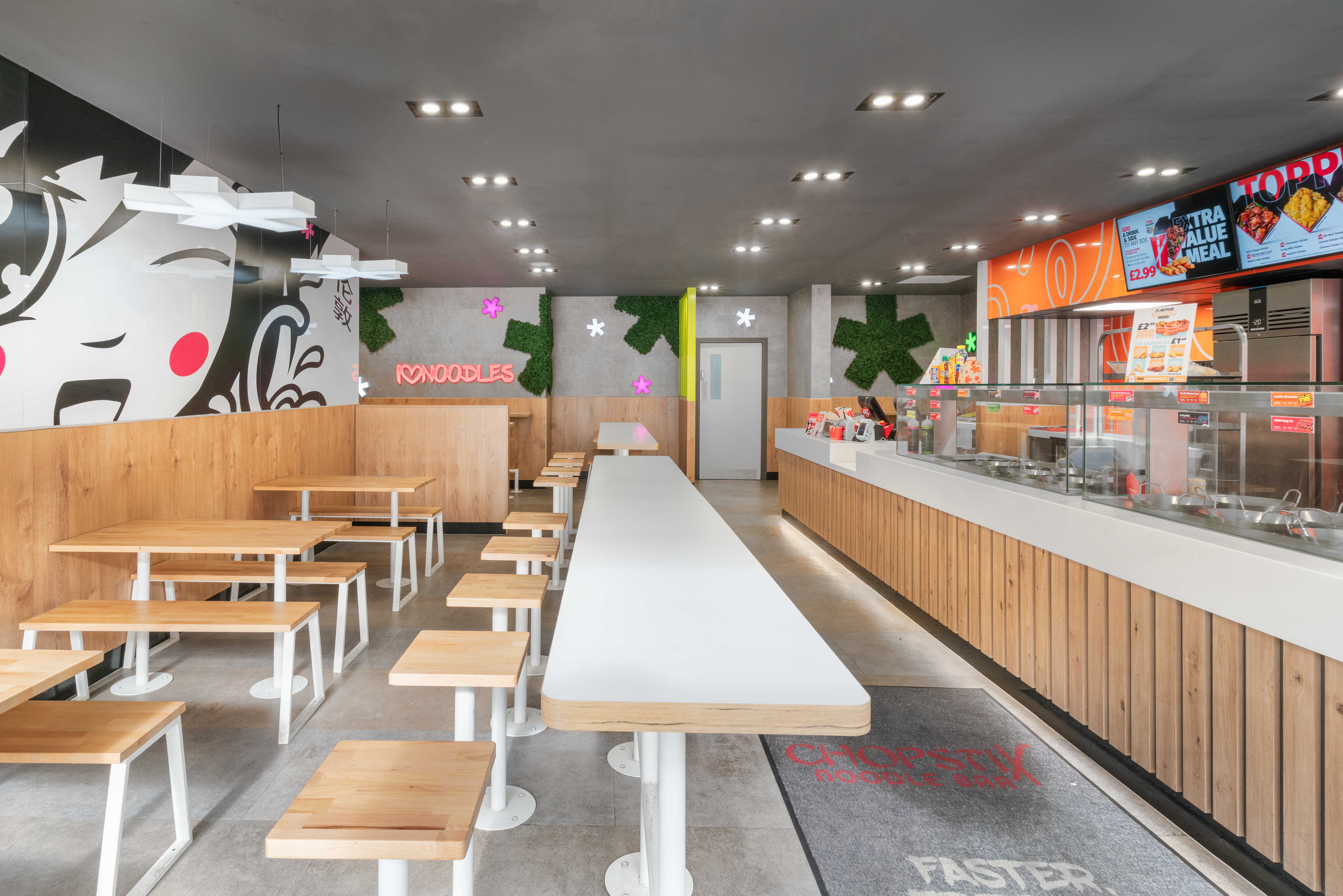
For quick service brands, this matters a lot. Reds, oranges, and yellows are often used because they heighten alertness and appetite. They encourage faster decisions and quicker turnover. In contrast, restaurants designed for longer visits often lean into blues, greens, and muted neutrals to create calm and ease. The goal of these designs has never been about decoration, but influencing behaviour.
Colour Choices and Commercial Intent
Good designers do not choose colours in isolation. They match palette to purpose. Restaurant colour design must support the business model. A lunch-focused cafe needs a different emotional tone than a destination dining space.
We often see problems when colour is selected based on personal taste rather than intent. Bright tones in a fine dining setting can feel rushed. Muted schemes in a fast-paced environment can drain energy. Understanding the psychological effect restaurant colours have on mood helps avoid these mistakes and aligns the space with how the restaurant actually operates.
Layout, Spacing, and Customer Comfort
Colour sets the tone, but layout is ultimately what controls behaviour. Restaurant UX design looks at how customers move, where they pause, and how comfortable they feel once seated. Spacing between tables affects privacy and noise. Aisle width affects staff movement and perceived crowding.
Tighter layouts increase turnover but can reduce dwell time, while generous spacing encourages longer stays but lowers capacity. Neither is right nor wrong. The mistake is not deciding which outcome you want. Effective restaurant UX design balances customer comfort with operational flow, using layout to support both service and atmosphere.
Lighting and Acoustics Matter Just as Much
Colour never works alone. Lighting changes how colour is perceived. Warm lighting softens bold palettes and makes spaces feel inviting. Cooler lighting sharpens contrast and increases alertness. Poor lighting can undo even the best colour scheme.
Acoustics also play a role. Hard surfaces reflect sound and raise energy levels. Soft finishes absorb noise and create calm. When lighting and sound are ignored, customers leave sooner, often without knowing why. This is where restaurant UX design and colour psychology overlap. Both shape how people feel without asking them to think about it.
Designing for Appetite and Dwell Time
The psychological effect that restaurant colour has on appetite is well documented. Warm colours increase stimulation and speed up eating. Cooler tones reduce the appetite but extend the stay. Designers use this knowledge carefully. Overuse can feel manipulative. Underuse wastes opportunity.
Successful restaurants apply colour with restraint. Accent walls, seating finishes, and feature lighting allow control without overwhelming the space. Combined with a thoughtful layout, restaurant colour design becomes a quiet driver of revenue rather than just a visual statement.
Brand Identity and Colour Consistency
Colour decisions also carry brand weight, and for chains and growing restaurant groups, such consistency is vital. Customers build expectations quickly, and colour plays a large part in recognition. A shift in palette between locations can unsettle that familiarity, even if the change is subtle.
That does not mean every site must look identical. Local context, footprint, and daylight conditions all vary. The role of restaurant colour design at this level is to establish a clear hierarchy. Core brand colours stay consistent, while secondary tones and textures flex to suit the space. This approach protects identity without forcing rigid repetition.
Staff Experience Shapes Customer Experience
Design choices affect staff as much as customers. Long shifts under harsh lighting or in visually chaotic spaces increase fatigue. Poor colour balance can strain focus and raise stress levels, particularly in open kitchens or counter service environments.
Restaurant UX design should account for this. Softer back-of-house palettes, controlled lighting levels, and clear visual zoning support concentration and movement. When staff feel comfortable and alert, service improves. That improvement is felt directly by customers.
Balancing Psychology With Authenticity
Colour psychology offers useful guidance, but it should never override authenticity. Customers respond best to spaces that feel honest. A colour palette that suits the food, the service style, and the brand story will always outperform a formula-driven approach.
The psychological effect restaurant colour has works best when it supports a wider design narrative. When materials, lighting, spacing and sound align, the venue feels considered rather than engineered.
Designing with this balance in mind allows restaurants to influence behaviour without forcing it. Customers stay longer, feel comfortable, and return because the experience makes sense. That outcome is not accidental. It comes from understanding how colour and design work together, and using that knowledge with restraint and intent.
If you are planning a new restaurant or reviewing an existing space, make an enquiry to discuss how colour, layout, and experience design can support both your customers and your commercial goals.
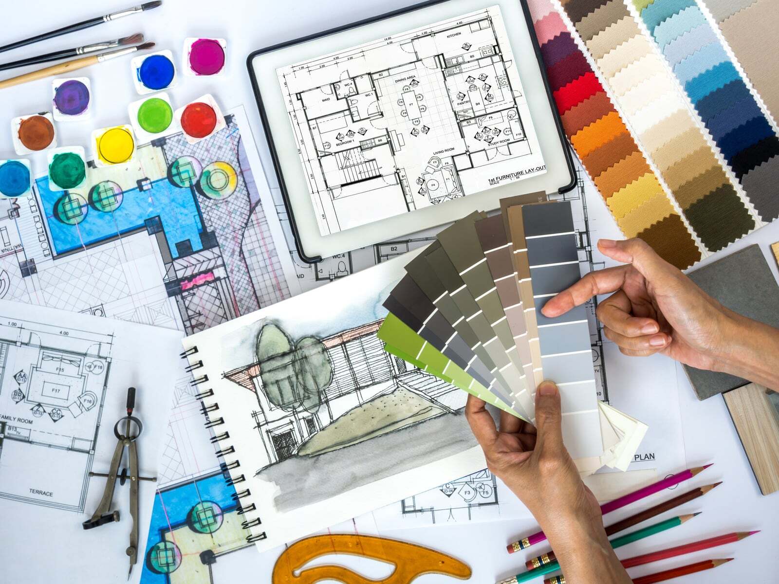
Image Source: Canva
A Guide to Help You Navigate Planning Permission and Building Regs
Using Interior Design Principles To Enhance Your Brand
No Comments Yet
Let us know what you think